

Background
Retailers, especially in FMCG, have widely adopted smart self-service to speed up checkout and cut queuing. MAGO, a Polish shop-fitting manufacturer, took this further with the CLEVER Trolley, combining self-checkout with the shopping cart itself, letting shoppers complete the entire journey with minimal help from staff. MAGO asked us to design a user-centered interface for it: by studying the trolley in a real store and mapping user flows, we delivered a new UX/UI that lets customers scan products and check out without waiting.
Objectives
- Research & Analysis: Study the market and audit the existing trolley flow and GUI for usability issues and opportunities.
- Design & Digital CX: Design a new user flow and digital experience for shoppers.
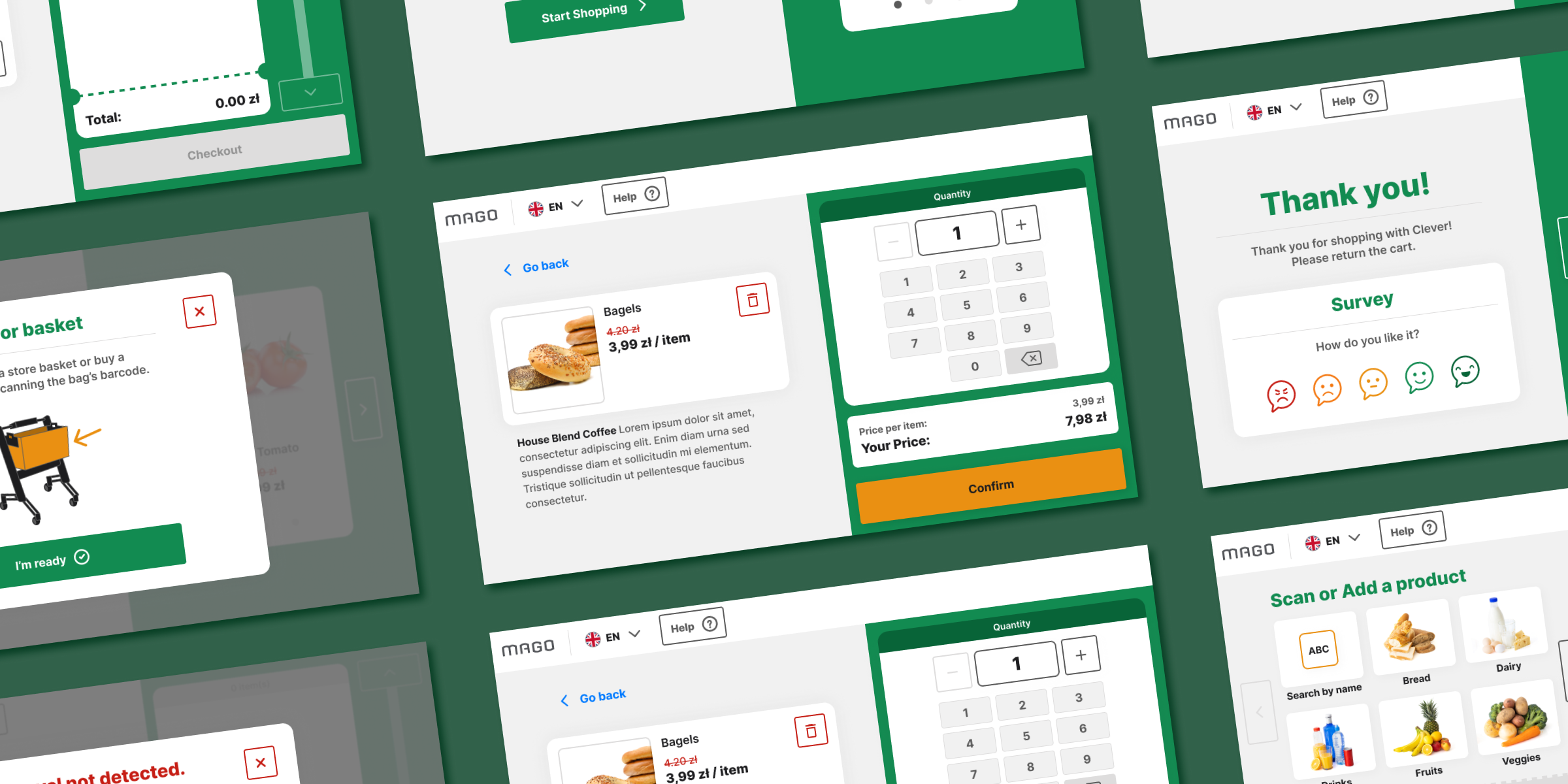
- New User Interface: Build a fresh UI component library for the CLEVER GUI.
Challenges
The interface had to be intuitive even for non-tech-savvy users, while accounting for the store environment, accessibility, and EU requirements for certified scales. The trolley's small screen left limited space for both interface and hardware, so we had to optimize a compact display without sacrificing usability. On top of that, products could be added in several ways, scanning, weighing, adding by quantity, and age-restricted items, each needing its own dedicated flow.
Research & analysis
Visiting a grocery store running the first version of CLEVER, we saw that scanning, weighing, and self-checkout integration already worked smoothly, though checkout itself wasn't yet live. We quickly spotted issues, not only in the trolley's features but in physical aspects like LED lighting and the onboarding process, with extra friction around removing items and verifying ID for alcohol purchases.
Designing an intuitive user flow
We built a new flow covering the whole customer journey, from noticing the trolley on entry to leaving the store. Mapping it let us meet user goals, surface bottlenecks, and minimize the need for staff assistance. These flows also became a framework for user testing and a shared reference aligning designers, developers, product managers, and stakeholders.
Cross-promotion & marketing opportunities
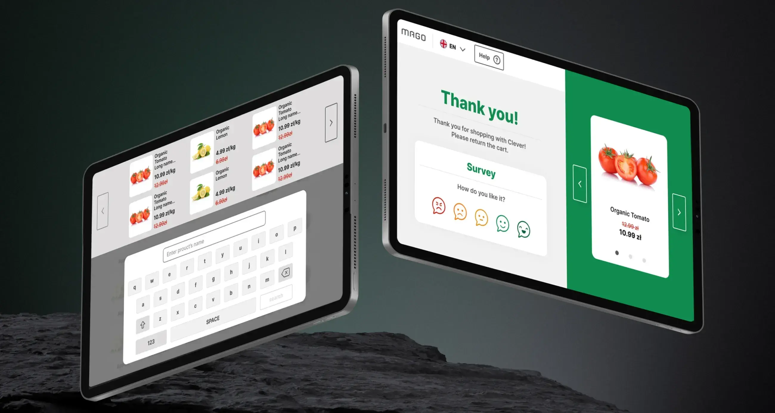
We identified ways for stores to use scan data to suggest complementary or alternative products, surface bulk-discount promotions, and recommend items based on cart contents, enriching the main scanning view and boosting engagement.
Final UI design
In designing the UI components and graphics, we kept essential functions, scanning, weighing, payment, highly visible and intuitively placed for a store environment, while staying compliant with regulations. The goal was a balance of usability and trust for every trolley user.